Project Goals: The Purple Corkscrew is a family-run wine bar with an eclectic mix of bottles, plus tapas, crêpes & regular tastings. This was a class project for a hypothetical client.
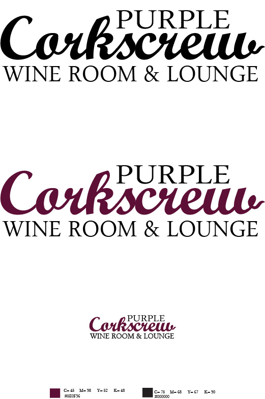
Creative Solution: For this logo I decided to be more typographic while emulating a sophisticated feeling. I went with a script typeface while manipulating the "w" into the shape of a corkscrew that is used to open a wine bottle. Lastly I made the logo a wine color to solidify memorability and association.
The original design:
The redesigned logo:
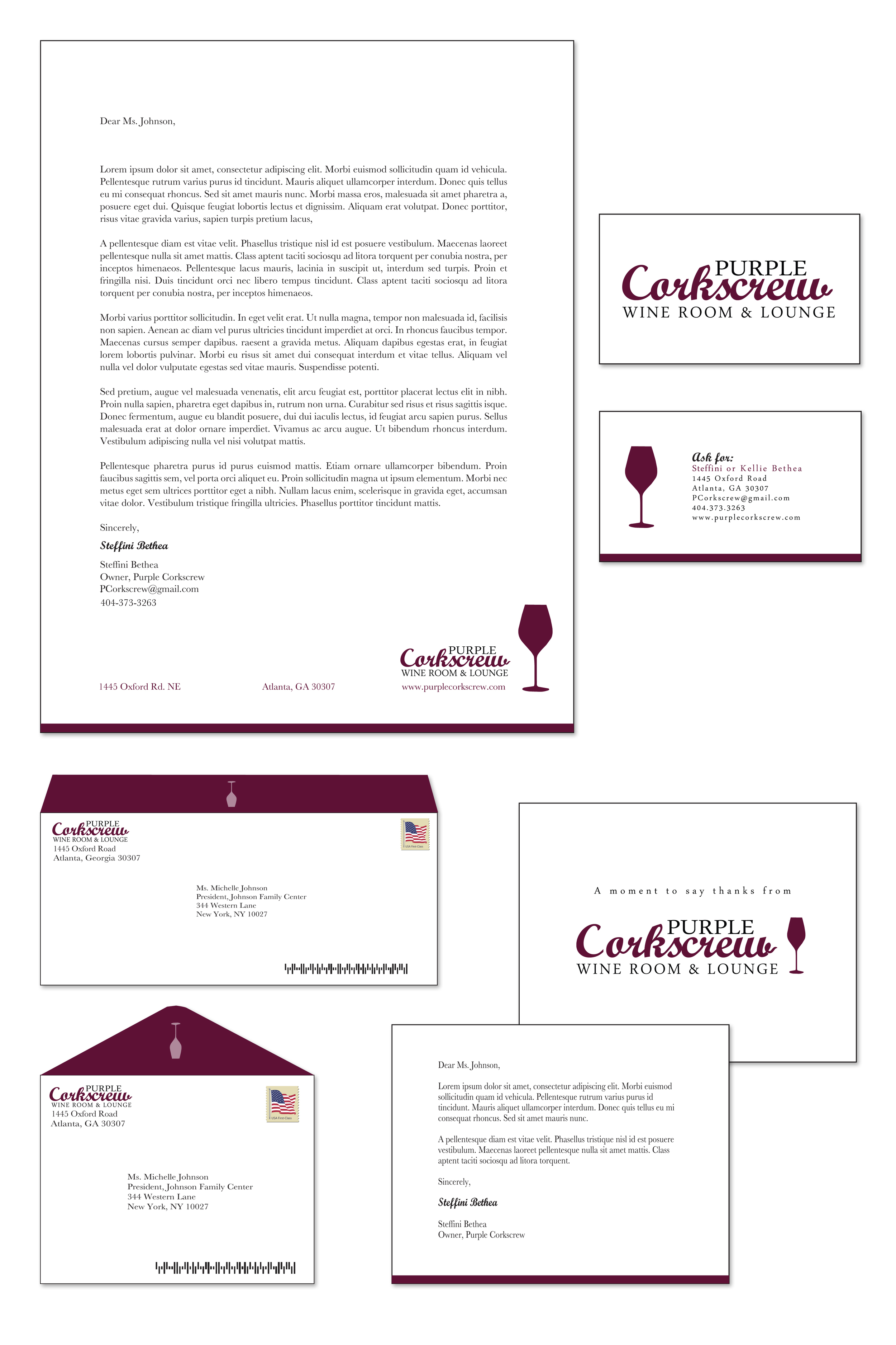
Stationary:


