While I was walking around the supermarket looking for a wine bottle to redesign, I came across Menage a Trois. I really didn't like the logo, nor did I really understand the concept (no offense to the creator). With that being said, I decided to challenge myself and redesign the logo.
The original logo:
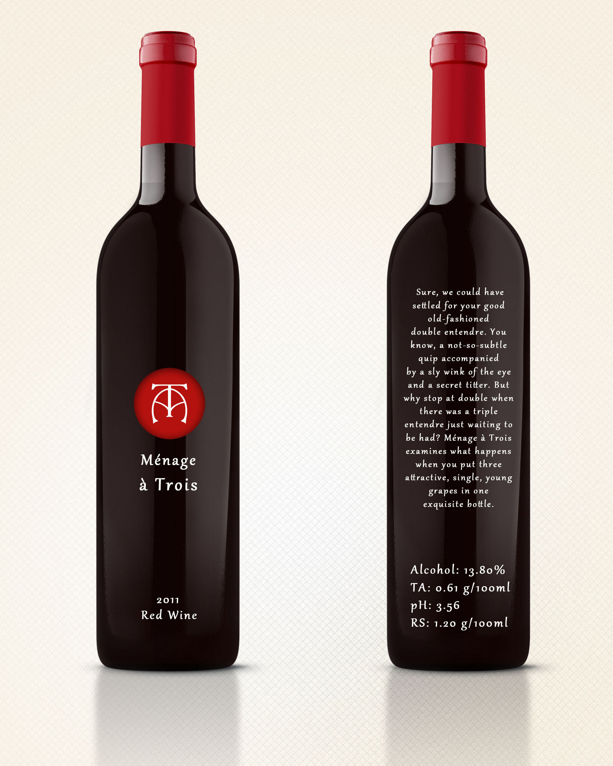
The redesigned logo:
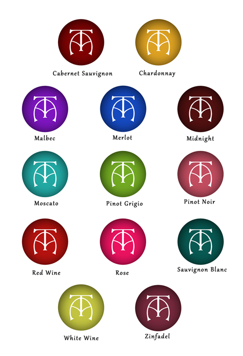
Menage a Trois' wines are also color coded by their blend:


