Overview: The International Center for Public Policy (ICePP) is an interdisciplinary public policy research center that engages over 20 faculty members from the Department of Economics, Department of Public Management and Policy within the Andrew Young School of Policy Studies (AYSPS) and faculty from the Department of Political Science and other departments at GSU. They house a staff, which consists of a management team, PhD senior research associates and administrators dedicated solely to center work. Below is the design while the company was using Drupal. The live site is currently being converted to Wordpress, which I am also working on. The design is mostly the same with a few minor changes.
To view that version, click here: http://icepp.gsu.edu/
Home Page: This is the template for website's home page. The main image is a clickable slider which rotates between the most important projects the company is involved in at the moment while the other buttons provide a either a solid link to their subject, a drop down, or a cutout to specifics. Since the International Center for Public Policy is housed in Georgia State University, its main color scheme are required to be synonymous with the university's color scheme red, white, and blue. Also because this is an international organization, it must give off the look and feel of diversity.
Regular Pages: Normal pages follow the template of a title banner at the top, information that is either static or hidden within an accordion, and the calendar of events displayed to the right.
Version 1
Version 2
Various Titles and Banners:
Regular Banners:
The banner for unavailable pages that are still under construction:
Silders:
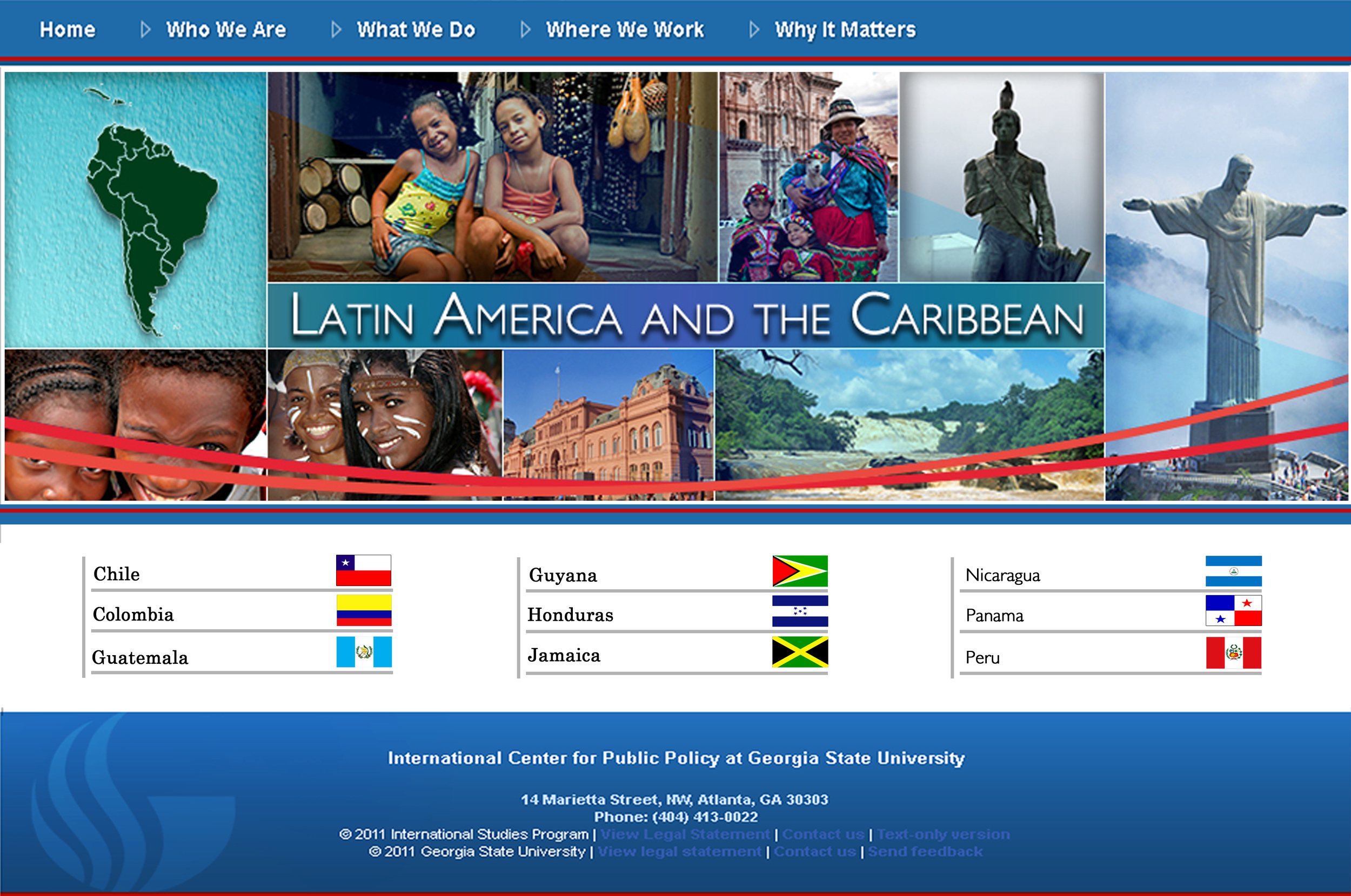
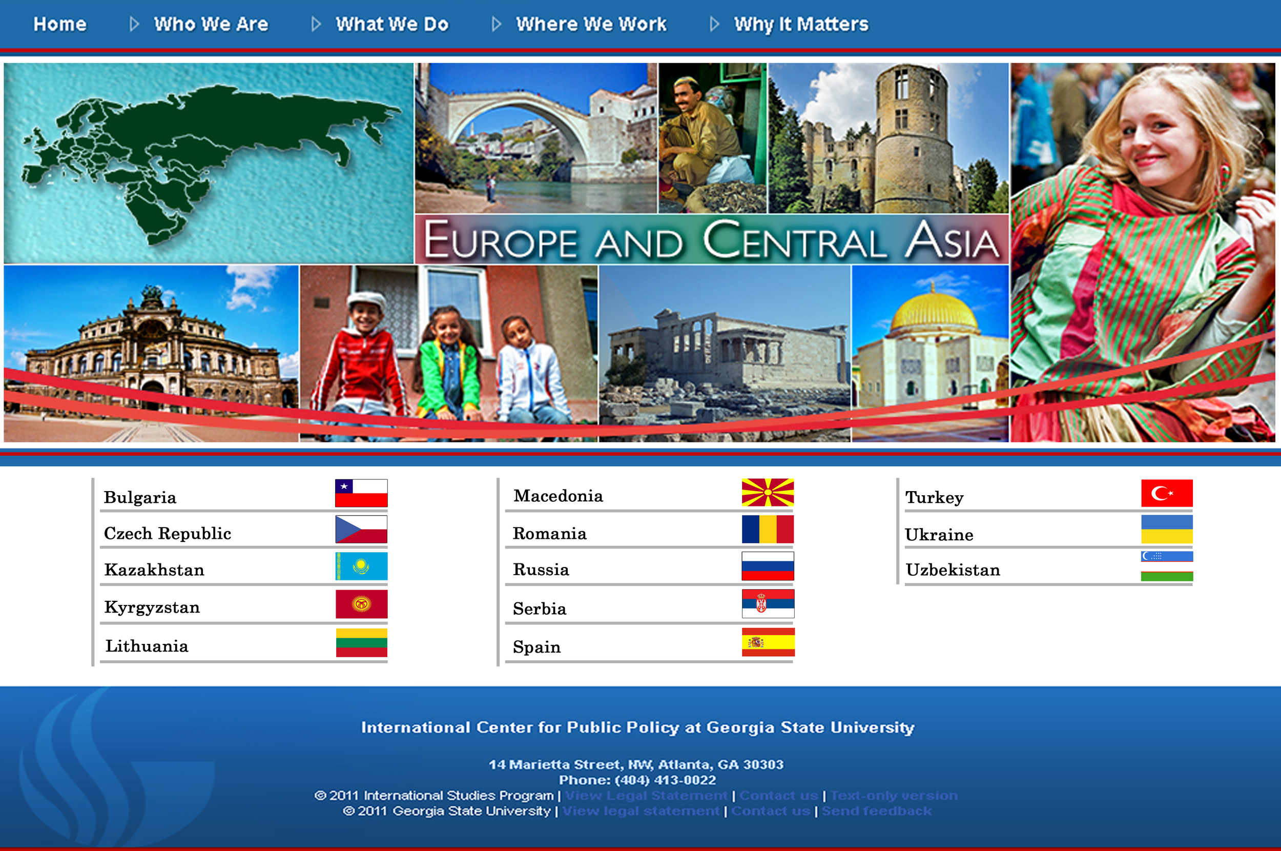
Country Pages: Due to the amount of projects ICePP has done, they wanted an easier and organized way of helping those who visited the site find the particular project they are looking for. In result, the country projects were divided into five regions, each containing their own landing page that displayed them as a list with links. Each banner contained the region's name, the map of the region involved, and images from that region, all while remaining consistent with the look and feel of the company's website.
The Historical Timeline: ICePP's history page is represented by its scrollable historical timeline. The landing page provides a collage of some of the customized images in the banner section, a calendar (by year) in the middle, and a bigger view of each project with a summary that links to an indepth version of the project.
In total, there are 39 different images representing each project highlighted by the International Center for Public Policy. Here are a sample of some of the images.
Summer Training: ICePP's summer training landing page features the current courses they are offering for anyone to take. Each of the course is color coordinated, line up with its current summer training banner. As for the information involving an overview of the courses as well as the description of how lodging and traveling will take place, they are display on a tab style that contains accordions. Due to the amount of information this page contains, its style makes the information easy to ready, and allows the user to separate information to what they are looking for.
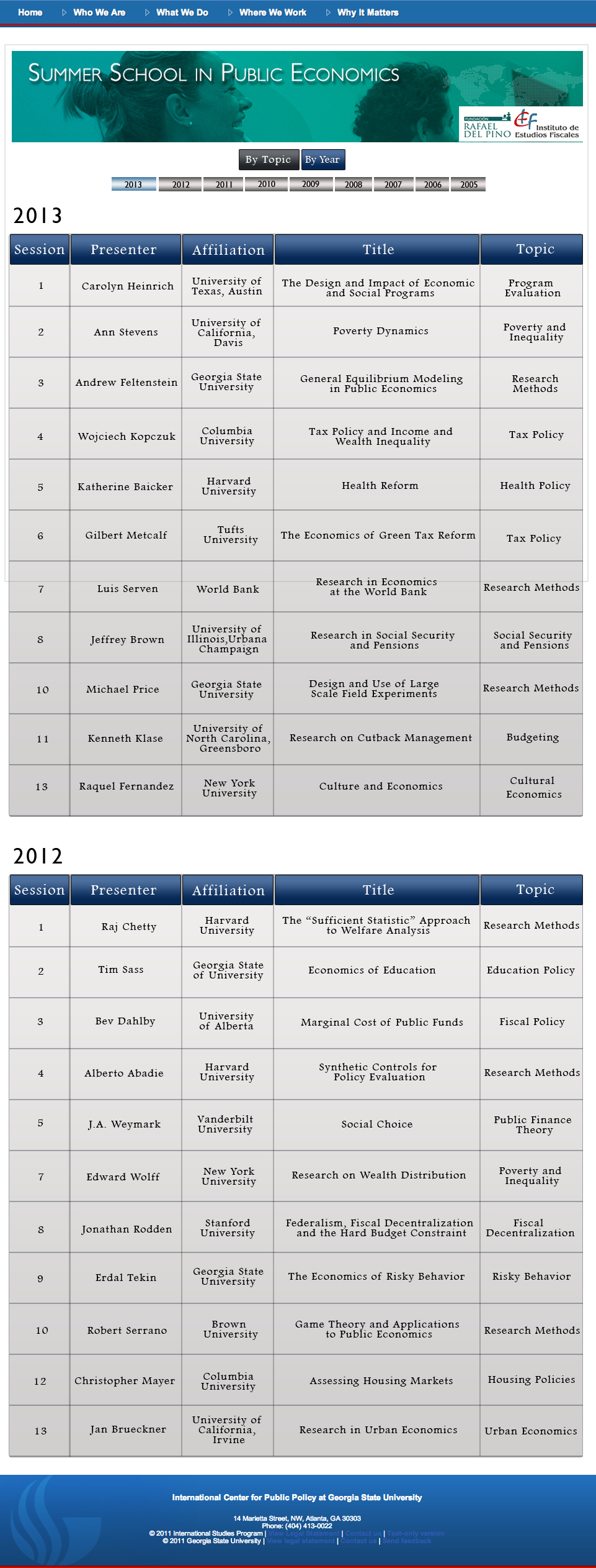
Tables and Videos: ICePP hosts various economic classes for many international government officials who participates in their programs. These classes are recorded and archived for later use and observation. As a result, a mockup for a video module as well as a table was needed to keep the heavy content organized. These are the mockups:
Thank you for viewing the Drupal version of the website. Once again, the company's website is being converted to Wordpress, in which I am also taking part of. To view that version, click here: http://icepp.gsu.edu/


